There are approximately 1.2 billion people with disabilities worldwide. Accessibility on the internet is therefore already required by law in many countries. However, accessibility does not only help people with disabilities, but can only be an advantage for the proper use of a website for each of us. In this blog, we will tell you the best practices and what to look out for.
Accessibility: Definition
According to the definition of barrierefrei.de, accessibility means "that every citizen can enter, navigate and safely use everything in the living space that has been designed barrier-free, independently and to a large extent without outside help". This also applies to accessibility on the internet.
Digital Accessibility: Definition
In short, digital accessibility means accessibility for all. Digital accessibility also describes a design concept "that aims to design products, environments, etc. in such a way that they can be used by a maximum number of people without further special adaptations. Accessibility is thus a consistent continuation of the idea of usability." (Source: Bertelsmann Stiftung)
An accessible website should therefore be accessible to all without additional or technical restrictions. Every:r visitor:in should be able to use all functions and interaction elements of the website regardless of personal and technical limitations. It should be designed to be appealing to both people with and without disabilities.
But when is my website accessible? In the following, we reveal the best practices for an accessible website.
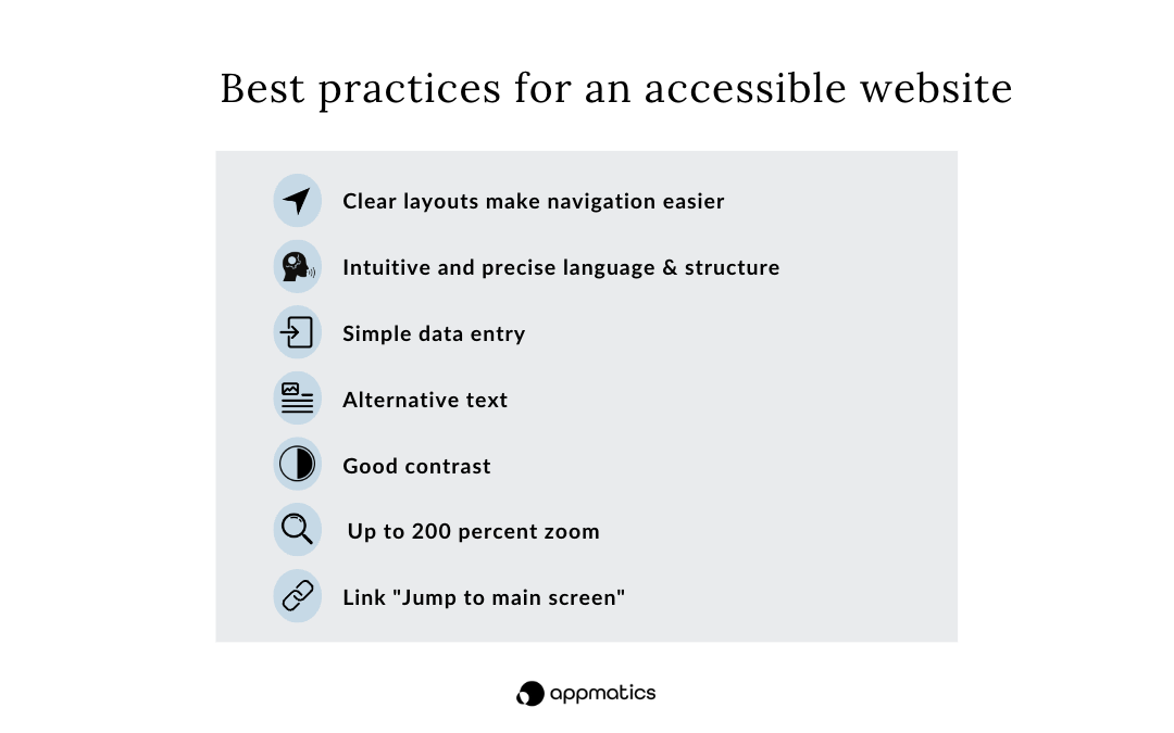
Best practices for an accessible website

Clear layouts make navigation easier
There are approximately 1.3 billion visually impaired users worldwide. To make it easier for these users to use web content, large fonts and high colour contrast are important. Smartphone users also benefit from this, as the content is easier to read on smaller displays. It also makes it easier for blind people to find their way around when using a screen reader.
Intuitive and precise language & structure
Each user has different cognitive abilities and reading skills. Likewise, there may be language barriers, as German is not spoken or understood everywhere. This is precisely why the content on an accessible website should be clearly and precisely formulated so that it is easy for everyone to understand.
A clear layout and highlighted headings not only help people with visual impairments, but also make reading easier for other users. They recognise the structure of the content better and know immediately where they are on the page. In addition, the headings also have a supporting function in terms of search engine optimisation.
Simple data entry
In addition to people with visual impairments or limitations, there are also people with limited finger mobility. Typing and touch gestures on the smartphone are very strenuous and difficult for this group of people. So wherever data has to be entered manually, a barrier appears for these people.
Every one of us has certainly come to the point where he or she found the constant filling in of data exhausting. And precisely because an accessible website is supposed to provide an easy condition for everyone, it needs input methods here that do not cause difficulties for anyone.
It is much more pleasant for all users if less data has to be entered. Text fields, for example, can be filled in automatically. Another solution is voice control, which is already used in many areas.
Alt text
The labelling of images and graphics with information content with an alt text (alternative text) is important so that screen readers can announce the label. Without an alt text, the information of images and graphics cannot be recognised by people with a visual impairment. Therefore, alternative labelling is very important for the accessibility of a website.The labelling of images and graphics with information content with an alt text (alternative text) is important so that screen readers can announce the label. Without an alt text, the information of images and graphics cannot be recognised by people with a visual impairment. Therefore, alternative labelling is very important for the accessibility of a website.
Good contrast
Good contrast makes the content on the website better and easier to read for people with visual impairments. How well colours contrast with each other on the page determines the accessibility of an accessible website for users. In addition, users can also use the software better in poor lighting conditions, e.g. dark screen or sunlight. So make sure that your accessible website has a good contrast between the content and the background.
200% zoom possible
When creating an accessible website, it should also be taken into account that there are also many people with impaired eyesight. Therefore, it can be helpful for this group of people to enlarge the page to 200%. The appearance of the website may change, but the texts, content and other elements must still be legible and easy to recognise without losing the structure.
Link "Jump to the main content of the page
The link "jump to main screen" helps especially keyboard users to navigate the page. Every multi-page website with a top-down menu should offer such a link. The term "main screen" refers to the main content of a page. This link is usually hidden unless it has focus. It is always used where pages have top or side menus. This allows the keyboard user:in to go directly to the information they want.
With these best practices, you can already make your website quite a bit more accessible. If you would like to learn more about accessibility on your website and how it can be tested, please contact us or simply visit our Accessibility Test page!